

Colleges
- AAC
- ACC
- Big 12
- Big East
- Big Ten
- Pac-12
- SEC
- Atlantic 10
- Conference USA
- Independents
- Junior College
- Mountain West
- Sun Belt
- MAC
- More
- Navy
- UAB
- Tulsa
- UTSA
- Charlotte
- Florida Atlantic
- Temple
- Rice
- East Carolina
- USF
- SMU
- North Texas
- Tulane
- Memphis
- Miami
- Louisville
- Virginia
- Syracuse
- Wake Forest
- Duke
- Boston College
- Virginia Tech
- Georgia Tech
- Pittsburgh
- North Carolina
- North Carolina State
- Clemson
- Florida State
- Cincinnati
- BYU
- Houston
- Iowa State
- Kansas State
- Kansas
- Texas
- Oklahoma State
- TCU
- Texas Tech
- Baylor
- Oklahoma
- UCF
- West Virginia
- Wisconsin
- Penn State
- Ohio State
- Purdue
- Minnesota
- Iowa
- Nebraska
- Illinois
- Indiana
- Rutgers
- Michigan State
- Maryland
- Michigan
- Northwestern
- Arizona State
- Oregon State
- UCLA
- Colorado
- Stanford
- Oregon
- Arizona
- California
- Washington
- USC
- Utah
- Washington State
- Texas A&M
- Auburn
- Mississippi State
- Kentucky
- South Carolina
- Arkansas
- Florida
- Missouri
- Ole Miss
- Alabama
- LSU
- Georgia
- Vanderbilt
- Tennessee
- Louisiana Tech
- New Mexico State
- Middle Tennessee
- Western Kentucky
- UTEP
- Florida International University
High School
- West
- Midwest
- Northeast
- Southeast
- Other
- Alaska
- Arizona
- California
- Colorado
- Nevada
- New Mexico
- Northern California
- Oregon
- Southern California Preps
- Washington
- Edgy Tim
- Indiana
- Kansas
- Nebraska
- Iowa
- Michigan
- Minnesota
- Missouri
- Oklahoma Varsity
- Texas Basketball
- Texas
- Wisconsin
- Delaware
- Maryland
- New Jersey Basketball
- New Jersey
- New York City Basketball
- Ohio
- Pennsylvania
- Greater Cincinnati
- Virginia
- West Virginia Preps
ADVERTISEMENT
Install the app
How to install the app on iOS
Follow along with the video below to see how to install our site as a web app on your home screen.
Note: This feature may not be available in some browsers.
You are using an out of date browser. It may not display this or other websites correctly.
You should upgrade or use an alternative browser.
You should upgrade or use an alternative browser.
I don't care for this new look.....doesn't do anything for me at all *
- Thread starter rockingamecock
- Start date
Hey, always appreciate any feedback.
When you say it "doesn't do anything for you", what do you mean? Have you checked out all the features yet?
I'm just asking because we've had several folks give feedback or ask questions and we were able to clear up some things later.
When you say it "doesn't do anything for you", what do you mean? Have you checked out all the features yet?
I'm just asking because we've had several folks give feedback or ask questions and we were able to clear up some things later.
One thing.....there's not enough contrast between the text and the white background.....or is that my settings?Hey, always appreciate any feedback.
When you say it "doesn't do anything for you", what do you mean? Have you checked out all the features yet?
I'm just asking because we've had several folks give feedback or ask questions and we were able to clear up some things later.
Since I'm not a paying customer I guess I can't complain too muchHey, always appreciate any feedback.
When you say it "doesn't do anything for you", what do you mean? Have you checked out all the features yet?
I'm just asking because we've had several folks give feedback or ask questions and we were able to clear up some things later.
")
One thing.....there's not enough contrast between the text and the white background.....or is that my settings?
I don't think there is any setting for that.
I don't like the topic listings/ thread listings. There seems to be more space taken up for each topic, so you can't see as many topics at once as you used to be able to see. It takes more time to scan all of the topics.
Also, it would be nice if maybe every other topic was a different color (think band view in excel), like alternating between garnet and white.
Once you click on a topic, it would be nice if there was a clearer seperation between posts from posters. Everything kind of runs together as it is.
I'm sure it'll just take a little getting used to though.
Even if you are not a "paying customer" you still generate traffic to the website. Paying for a subscription or not, rivals still makes money.Since I'm not a paying customer I guess I can't complain too much
Websites should be designed for a desktop/mouse environment, not mobile or laptop or touchscreen users. The latter require compromises that degrade the experience and functionality for everyone.
Love the new format. Huge improvement!! At least on mobile it is. Don't really care about a desktop version.
Love the new format. Huge improvement!! At least on mobile it is. Don't really care about a desktop version.
Just curious. How old are you? My guess is that the younger posters care more about the mobile version. It'd be interesting to see a graph by age of happiness with the new version.
I know I mentioned some of these things yesterday Chris, so I won't go on in every thread about the new format, but I agree with the others here...(using a PC don't know how it looks on mobile) but....
No defining lines between boxes...the text is too light....the main page is way too busy so it takes more effort to scroll and see all the topics (finding one you were previously interested in), not just way more scrolling to see the 50 headlines, but the topics themselves are cluttered, busy, and faint. Just not as easy to find a thread you had been reading or posting in previously.
Yes it looks more modern and updated, I'll give ya that, but the functionality has gone down, at least for PC users.
And for God's sake get a "Browse and click" button to post a pic!! (lol)
OK, done griping, won't go on and on, will use the like button when others gripe though lol...love the like button, good improvement
Cocky kebo57
Well-Known Member
Agree 100% about the contrast between the light gray text and the white background!! Really makes it HARDto read, especially on my smartphone with a 4.3" screen. Can anything be done about that?
Just curious. How old are you? My guess is that the younger posters care more about the mobile version. It'd be interesting to see a graph by age of happiness with the new version.
I am 30. Use mobile about 95% of the time. I actually stopped paying for TIF because I was so frustrated with mobile version of this site. I'm sure the looks could be improved, I'm mostly just happy with the functionality of the site.
Websites should be designed for a desktop/mouse environment, not mobile or laptop or touchscreen users. The latter require compromises that degrade the experience and functionality for everyone.
This one is designed for both. It's a responsive design.
Any questions you have about the functions, etc.?
I am 30. Use mobile about 95% of the time. I actually stopped paying for TIF because I was so frustrated with mobile version of this site. I'm sure the looks could be improved, I'm mostly just happy with the functionality of the site.
Let me know if you have any questions about getting back on board - lots of great content on TIF right now.
The new format is terrible.
Anything specific you don't like, or do you have any questions?
I'm asking because since yesterday, I've had a ton of questions about why the board doesn't have this or that or do this or that when it actually does. This takes some getting used to, we know.
Agree with the division of opinion by age. When I see Millennials glued to their cellphones, I think of babies with rattles. Unless the object is shiny, the attention span is virtually nill.
I can't check out anything on my cell phone. I have tried to open posts and have gotten Illinios prep and Edgy prep pages. On a computer it seems to be ok . The old version worked on my cell this current format as of this posting has not. It is becoming very furstrating I must say.
The main thing I have read, and agree with, is that the light grey is hard to read and the bigger problem for PC'ers is that it just seems way too spaced out as others have mentioned. You have to scroll a mile down the main page just to see a handful of thread topics. I'd like to be able to collapse it somehow and make the coloring of the wording darker. This seems to be the main complaint and as of yet, I haven't read anyway to change the look.
Someone keeps asking "Are there features you'd like to see? etc, etc, etc"
YES. I want to be able to collapse the view and make the wording darker please.
Someone keeps asking "Are there features you'd like to see? etc, etc, etc"
YES. I want to be able to collapse the view and make the wording darker please.
Same on my screen Very light text against whit background...One thing.....there's not enough contrast between the text and the white background.....or is that my settings?
Chris, from what I have read since I last posted, it seems like the thread view is gone forever. THAT is why things seem soooooooo spaced out. Topic view it is then. I'll get used to it. What choice do I have? Lol.
I do understand the updated features and they are nice. It does seem to be more 'fluid' and responsive.
The thing I cannot get over though is the light background and light grey "look." It's beyond bad. Terribly hard to read. As someone else mentioned, the "borders" to the left of the page can barely be seen. (I'll come back to this) And as someone else stated, almost the entire 1/3 rd of the right hand side of the screen is just blank. It has a "snow blindness" feel too it. It's so much white, it just looks odd.
About the borders, no, I do not need to adjust my screen settings for gamma or contrast or anything else. I do photography work in Lightroom and I assure anyone reading this, my settings are calibrated perfectly for everything. Add to that the fact that my "monitor" is actually a 50" HDTV screen.....and I still can't see past the "white." It's pretty bad.
But again, what choice do I have? I'll suck it up and carry on.
I can't check out anything on my cell phone. I have tried to open posts and have gotten Illinios prep and Edgy prep pages. On a computer it seems to be ok . The old version worked on my cell this current format as of this posting has not. It is becoming very furstrating I must say.
I'm confused about why that would be happening and it's the first I've heard of it. Try clearing your browser cache.
I like it, also but liked the old way better.
I like the way Chris responds to posters. He's not a smart aleck and doesn't let his power to ban go to his head. I once posted a link to a 247sports article and he emailed me and told me that I shouldn't do that since they are a competitor. I didn't know that and of course won't do again.
I like the way Chris responds to posters. He's not a smart aleck and doesn't let his power to ban go to his head. I once posted a link to a 247sports article and he emailed me and told me that I shouldn't do that since they are a competitor. I didn't know that and of course won't do again.
Ok i'll try that thank youI'm confused about why that would be happening and it's the first I've heard of it. Try clearing your browser cache.
I like the new features, but like the old format.
I also don't understand how some are having contrast issues. For me, it is black writing on white background.
Also, the mod controls are light years better. The old ones were the Dark Ages.
I also don't understand how some are having contrast issues. For me, it is black writing on white background.
Also, the mod controls are light years better. The old ones were the Dark Ages.
Cocky kebo57
Well-Known Member
It works great on my cell. Way better than the old format.
I'm having some issues using this new site on my cell phone.
I'm having some issues using this new site on my cell phone.
If you can give us more specific details perhaps we can help.
I'm middle aged so i fit in both categories. The new look sucks on the desktop. But it's great on my iPhone.
the bigger problem for PC'ers is that it just seems way too spaced out as others have mentioned. You have to scroll a mile down the main page just to see a handful of thread topics. .
This x 100,000!! The completely useless box on the right that shows your stats eats up entirely too much column space, restricting the number of posts you can see at once. You can zoom in to make the posts stretch from the left margin to right but the font is so large you can only see two posts on an entire page.
Just not a fan, I could view 20-25 threads without touching a button with the old topic view and be through the first page of threads with three or four clicks, now I will have to go to three or four pages to see that many threads. I can promise you I wont be seeing as many threads with this format because I will very rarely be going to page two, I will miss a lot of threads and posts, because I'm just not going through 3 or 4 pages to see them., but like someone else said, no need complaining about something that is free. I do like the top/bottom of page button though!
So I have been enjoying the mobile version but decided to crank up the old laptop to see what the complaining was all about. I do have to admit, the desktop version looks pretty bad. Not nearly as bad as the new ESPN mobile site but it's still not great. Luckily for me I mostly use mobile. I'm only speaking to the look of it. Didn't post or try to do anything with it.
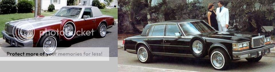
In my humble opinion, this represents what we had...

...and below is what we have now. These are all Cadillac Sevilles, above the "old" ...below the "new and improved" .... modern, updated, with all kinds of new features...
Sometimes change is not for the better....notwithstanding the fancy new spare tire holder that we never knew we needed
Similar threads
- Replies
- 2
- Views
- 366
- Replies
- 4
- Views
- 636
- Replies
- 131
- Views
- 3K
ADVERTISEMENT
ADVERTISEMENT