ADVERTISEMENT

I don't care for this new look.....doesn't do anything for me at all *

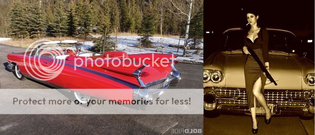
In my humble opinion, this represents what we had...


Now_zpss5o28nb2.jpg


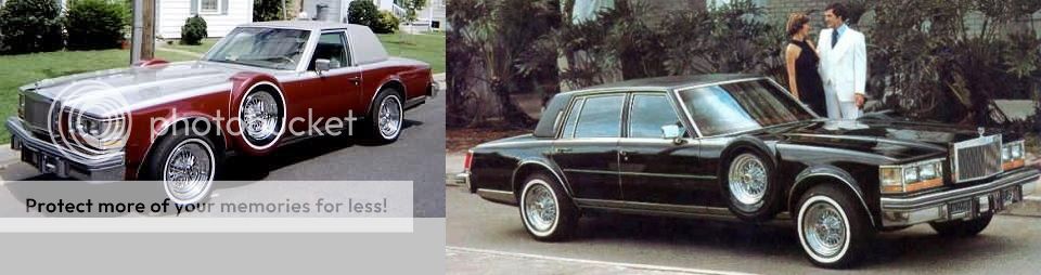
...and below is what we have now. These are all Cadillac Sevilles, above the "old" ...below the "new and improved" .... modern, updated, with all kinds of new features...

Sometimes change is not for the better....notwithstanding the fancy new spare tire holder that we never knew we needed ;)


after_zpswf47zrym.jpg

I can understand your analogy, if you're not a huge fan of the new board (which is quite obvious to me by now you're not).

However, an old Caddy isn't much good if it doesn't run. Our old board was ridden with tech issues, didn't work well on mobile (like it or not, TONS of folks use mobile for the web now), crashed often, etc.

I've laid out the updates (not just changes, but upgrades) several times and most of them were things our subscribers asked for.


I would encourage everyone to give the new look and features some time, and I think you'll eventually like them. Like anything in life, some love it and some don't love it as much.

You're entitled to your opinion, but every staffer on the Rivals.com network and an overwhelming majority of our subscribers (customers) *wanted* change.
 
I guess if you are out to make the mobile users happier than the PC users then mission accomplished. I think pretty much all of the complaints are from people like me that only use a PC. (Thank God, for there are waaaay to many people staring down at their phones when they're out of the house!).

The flaws for us will not improve, it isn't a matter of getting used to the new look, it's a matter of it not being as user friendly as the old look, for all the reasons you have heard. The fact that we have to scroll and scroll and scroll to see the same amount of headings as we did with one screen view will not improve. It sounds like the faint letters will not be getting darker, nor the difference in font between the threads read and the threads with new comments. We will have to settle and deal with it, and we will, but it won't become a better way, only a way that we will get used to "dealing with." At least for PC users.

I do like the "like" button though! See, I can give a compliment! ;) :)

We're not out to make one group happier than the other. I'm just saying that here at GamecockCentral.com we're running a business. This site exists because of our paid subscribers, to be blunt. If a very high percentage of them are viewing the site on mobile primarily and/or want to be able to utilize it on mobile, then we need to give them that capability or we are hurting ourselves as a business. The reality is that mobile numbers are skyrocketing in terms of web browsing, media, etc. It's a matter of keeping up with what our subscribers want.

We have plenty of primary desktop users that have told us they love the look and functionality, etc. As I've said, it's a personal preference thing for many. We knew some would be upset with the changes, but I could send our information via brain wave to folks and someone would still prefer it be done another way. That's OK, and that's the nature of it.

The new look, in many ways, is much more user friendly - I'm basing this on the fact that a) it works and isn't glitch-ridden, b) it's more mobile friendly, c) there are most posting features, media embedding, etc. d) alerts, etc. and on and on.

I'm sorry about the colors, I need to check into that because the contrast for me is completely fine. I've had several others say the same.

If we had to trade in having to scroll a bit more to see more topics for everything else we got, I think that's a fair tradeoff.
 
  • Like
Reactions: bashby33
I am on a pc and I can't stand the
Just not a fan, I could view 20-25 threads without touching a button with the old topic view and be through the first page of threads with three or four clicks, now I will have to go to three or four pages to see that many threads. I can promise you I wont be seeing as many threads with this format because I will very rarely be going to page two, I will miss a lot of threads and posts, because I'm just not going through 3 or 4 pages to see them., but like someone else said, no need complaining about something that is free. I do like the top/bottom of page button though!


I agree...don't think I will ever bother to go past page one!
 
We're not out to make one group happier than the other. I'm just saying that here at GamecockCentral.com we're running a business. This site exists because of our paid subscribers, to be blunt. If a very high percentage of them are viewing the site on mobile primarily and/or want to be able to utilize it on mobile, then we need to give them that capability or we are hurting ourselves as a business. The reality is that mobile numbers are skyrocketing in terms of web browsing, media, etc. It's a matter of keeping up with what our subscribers want.

We have plenty of primary desktop users that have told us they love the look and functionality, etc. As I've said, it's a personal preference thing for many. We knew some would be upset with the changes, but I could send our information via brain wave to folks and someone would still prefer it be done another way. That's OK, and that's the nature of it.

The new look, in many ways, is much more user friendly - I'm basing this on the fact that a) it works and isn't glitch-ridden, b) it's more mobile friendly, c) there are most posting features, media embedding, etc. d) alerts, etc. and on and on.

I'm sorry about the colors, I need to check into that because the contrast for me is completely fine. I've had several others say the same.

If we had to trade in having to scroll a bit more to see more topics for everything else we got, I think that's a fair tradeoff.


I realize you must do what's best for the majority of paid subscribers, as this is a business. I guess there were glitches in the mobile version I never knew of, everything always worked great on my PC. BTW, I was a paid subscriber for several years...

As to the better posting features, PLEASE, for everything that is Holy (lol), add a "browse and click" button to post pictures! I do know you said you would look into this, but stay at it please. I mean this in all sincerity without being a smart ass when I say I am astounded that a site could do all the updates etc that have been done and still make people go to a web service and jump thru the hoops to post a picture. If I get a browse and click button I promise not to gripe about the other stuff! :)

....well, not as often at least...;)
 
I get it. Us older PC users are not welcome here. I do agree that this site's appearance is better than the ESPN debacle.

Never, ever, ever, did I say that. This is actually what I said above:

"We're not out to make one group happier than the other."

We had to do things based on what was best for our business. Upgrades were much needed, and that's not a guess on my part. This was something that happened across the entire Rivals.com network.

You are more than welcome here. You're saying you don't like the new format, I guarantee you way more folks were unhappy with the old format based on how many emails/message board posts/in-person comments I received about it.

All we ask is that people give the new boards a try. Our content is the exact same, and these new boards run better, have more features, etc.

I use a PC more than I use mobile for the purposes of reading this site and for working on it. Am I not welcome?
 
I realize you must do what's best for the majority of paid subscribers, as this is a business. I guess there were glitches in the mobile version I never knew of, everything always worked great on my PC. BTW, I was a paid subscriber for several years...

As to the better posting features, PLEASE, for everything that is Holy (lol), add a "browse and click" button to post pictures! I do know you said you would look into this, but stay at it please. I mean this in all sincerity without being a smart ass when I say I am astounded that a site could do all the updates etc that have been done and still make people go to a web service and jump thru the hoops to post a picture. If I get a browse and click button I promise not to gripe about the other stuff! :)

....well, not as often at least...;)

Trust me, it's been noted that you want an update to the picture posting. I believe that's coming down the pipe in the future.

The mobile site wasn't fully functional (for example, you couldn't even quote a post to reply to it) and it did have technical issues just like the desktop version. Everything (from a functional standpoint) is upgraded.
 
Will continue to come back. However, there is not enough contrast between the print and the background and it is hard to discriminate between topics, posts, posters, etc.
I am on a mobile device.
 
its taking some getting used to for me, but it was hard the first time for me with the old board
 
I, too, don't like that there is not enough contrast between the light grey background and the dark lettering. I noticed that the few posters that made their posts in bold letters made it much easier to read their posts.
 
ADVERTISEMENT

Latest posts

ADVERTISEMENT