I know you'll disagree, but that really annoys me. They should be using the Block C which is the logo of the University of South Carolina Gamecocks. Whoever agreed to that development needs a spanking.
I've said this forever.


Follow along with the video below to see how to install our site as a web app on your home screen.
Note: This feature may not be available in some browsers.
I know you'll disagree, but that really annoys me. They should be using the Block C which is the logo of the University of South Carolina Gamecocks. Whoever agreed to that development needs a spanking.
I like having both logos. I wear stuff with the Block C/Gamecock during Football/Basketball seasons. And I wear our interlocking SC during baseball. My Yeti has the interlocking SC on the front of it. The Block C/Gamecock is still the registered trademark of the University of South Carolina. Really only 2 teams use the SC, and that's baseball and softball. For baseball basically the only place it appears on the official uni is on our lids. It's not on our garnet pins, nor our Yankee greys. I think it's only on our white with black piping unis.I know you'll disagree, but that really annoys me. They should be using the Block C which is the logo of the University of South Carolina Gamecocks. Whoever agreed to that development needs a spanking.
Sometimes the SEC network uses a Gamecock instead of the block c and it looks great. I believe it would look great on our helmets.No thanks to changing the logo to the SC. It can cause confusion as to who SC is.
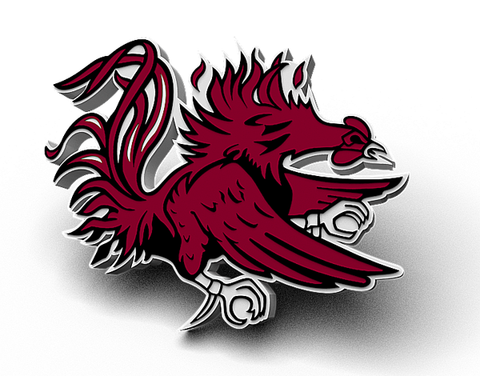
Gamecocks is our brand and that giant rooster needs to be the logo. We are the only Gamecocks (Jacksonville State doesn't matter ) and any sports fan recognizes the Gamecock logo.
If you were to do anything I would say drop the block C and use the Gamecock alone as it sticks out more when done.
Who came up with that anyway?Why is no one proposing the Shawn Elliott era chicken ass helmet design for our rebranding efforts? It was definitely a unique look.
I am a CU fan so have hardly a platform from which to answer a question like this. But as an outsider looking in who would like to see SC succeed at a rate only a half step behind CU, I think this has some very valid points. To continue to fight NC and Southern Cal over a abreviations already owned by them in the public mind is a losing propostion, I think. We can think 'USC' or 'Carolina' means South Carolina, but if a guy in Peoria doesn't think so it doesn't matter what we think. That cannot be changed. Find other ways of identifying the brand.
our policy of splitting money equally in the SEC having two teams in CFP will have even more money in this year.
Which is more money if they weren’t in the CFP. $430k will buy a couple car washesThe playoff only pays $6 million per team, so you're looking at roughly $430k.
")
I think to be specific it should be an SC in the block. The people in SC might know what the C stands for but someone outside the state doesn't have a clue. Sometimes change is good.You're putting an awful lot of weight behind what people in Peoria, Illinois think. Personally, I'm more interested in what 5 million South Carolinians think. And to them, "Carolina" is South Carolina. "USC" is South Carolina. If the other 49 states think differently, so be it. I'm not losing sleep over it
And the whole ESPN SC State Bulldog fiasco?? That's raw incompetence on the part of ESPN staffers. Period. End of story.
Long live the Block C. Long live the Gamecocks!
Block C logo all the way. Interlocking baseball logo has already been lost in court. I could be wrong but Southern California is "allowing" us to use it.
Actually it is ours. CRT designed it himself, and I still have one of the team sweatshirts from his first season when he debuted it.
It looks NOTHING like the SoCal interlocking SC logo. They just got their knickers in a pinch when famous people were seen in SoCal wearing our logo and not theirs.
The Block C looks great, and should always remain our primary logo. It's a very unique logo, and we've used it since the mid-70's. It's our tradition/brand, so don't mess with it. I like the baseball "SC" logo as well, as it looks sharp on the caps/uni's. Plus, a lot of schools have a secondary logo for their baseball caps (i.e. LSU, FSU, Clemson, Miami, Arkansas, etc.). Go Cocks.
I am a CU fan so have hardly a platform from which to answer a question like this. But as an outsider looking in who would like to see SC succeed at a rate only a half step behind CU, I think this has some very valid points. To continue to fight NC and Southern Cal over a abreviations already owned by them in the public mind is a losing propostion, I think. We can think 'USC' or 'Carolina' means South Carolina, but if a guy in Peoria doesn't think so it doesn't matter what we think. That cannot be changed. Find other ways of identifying the brand.
The paw came along before such things were necessary, but it has become that for Clemson. Some on this board enjoy saying, "People don't even know where Clemson is." As untrue as that might be, does it now even matter? They know what that paw is, and that is all that matters, as CU has proven. SC should develop, adopt and promate a similar brand, I think.
In terms of visuals, the circle decals on the helmets, white on Garnett or Garnett on white, seem artificial, just something to stick on a helmet. The official Gamecock logo is indistinct, a busy flurry of artistic lines rather than a memborable imprint. A child should be able to draw a logo on his school book covers. I am not an artist, so I don't have any alternatives to suggest, but I think South Carolina needs something simple and compelling, something that the mind will remember and tie to "South Carolina".
We are not Southern California. We are not North Carolina. We are South Carolina. Whatever unofficial logos they have, they have. We should forget those logos, choose to not even like them, and develop something that anyone can look at and think, "South Carolina". The current gamecock cannot do that, nor can "USC" or "Carolina". South Carolina needs something else. Get out of the 'tis-so-'tis-not fight with those two schools and go in another direction. It can be done, I think, and should be.
Having done that, my opinion is to stick to one set of uniform combinations. The blacks and grays and chromes look like the gimmicks that they are. Oregon can do it because the gimmicky combinations ARE their brand. Everyone else is a copycat at best, grasping at worst. In terms of identity, develop it then sell it, sell it, sell it.
No thanks to changing the logo to the SC. It can cause confusion as to who SC is.
Gamecocks is our brand and that giant rooster needs to be the logo. We are the only Gamecocks (Jacksonville State doesn't matter ) and any sports fan recognizes the Gamecock logo.
If you were to do anything I would say drop the block C and use the Gamecock alone as it sticks out more when done.