ADVERTISEMENT

Dumb Sports Logos

Bud Wiser

Member
Aug 14, 2021
895
1,667
93
1024px-Cincinnati_Bengals_logo.svg.png

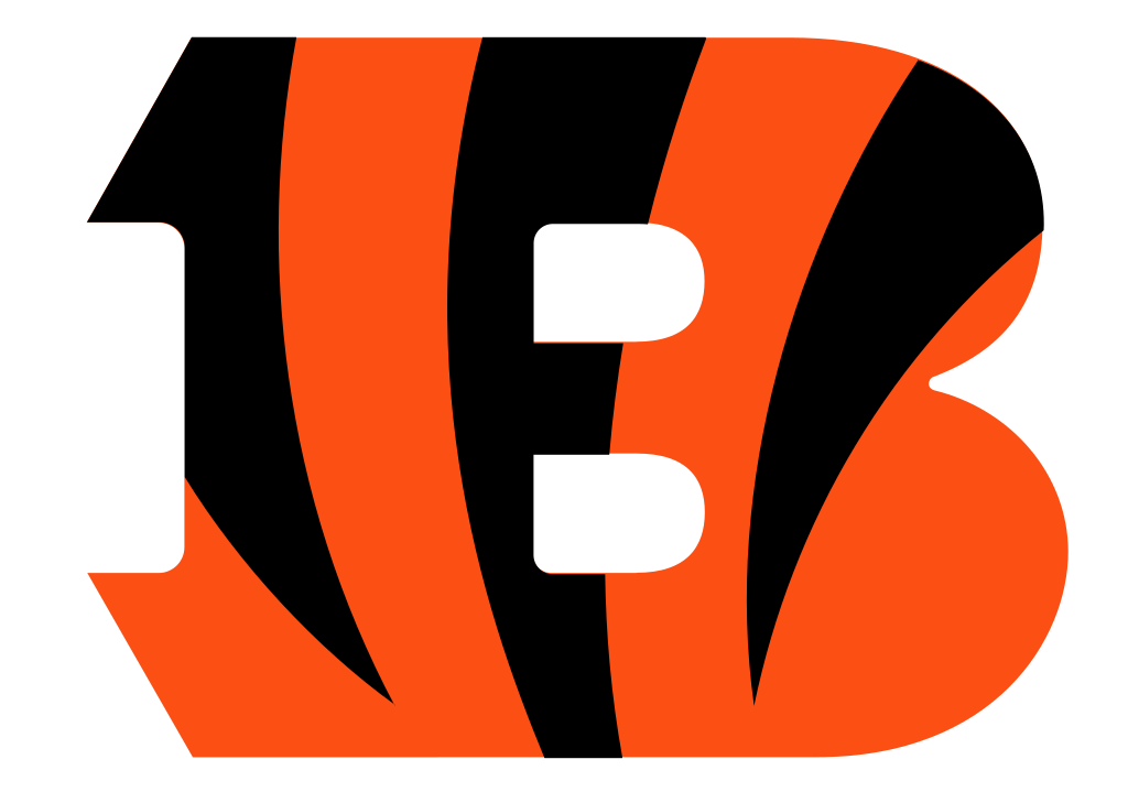
Watching the Bengals - Jaguars game and just thinking how dumb this logo is. First, it looks awful. But even worse…it’s a B for Bengals. It would be like the Packers having a P logo instead of a G. Of us putting a G at midfield for Gamecocks. If they want to do this logo, do a “C” for Cincinnati!

Just makes me wonder how something so dumb gets approved by people and sticks around so long.

What other dump logos, besides a paw print, can you think of?
 
  • Like
Reactions: usc1855
Not a big fan of the current Charlotte Hornets logo. They should go back to the old one. I also think LSU’s midfield logo deserves an honorable mention.
 
  • Like
Reactions: Bud Wiser
Bengals owner is one of the biggest idiots in all of sports. Everything about that franchise is done on the cheap and corny.
 
I know this isn't exactly the same thing but what about Clemson's mascot? How could any group of sane adults agree on that thing with the meth addict eyes to represent them?
Those eyes are the creepiest thing in sports. I always thought it makes that mascot look like a pedophile.
 
  • Like
Reactions: Bud Wiser
1024px-Cincinnati_Bengals_logo.svg.png

Watching the Bengals - Jaguars game and just thinking how dumb this logo is. First, it looks awful. But even worse…it’s a B for Bengals. It would be like the Packers having a P logo instead of a G. Of us putting a G at midfield for Gamecocks. If they want to do this logo, do a “C” for Cincinnati!

Just makes me wonder how something so dumb gets approved by people and sticks around so long.

What other dump logos, besides a paw print, can you think of?
Falcons do it with an F
Steelers have Steelers Written on their helmets
Oakland A's have A's on their helmets
Arizona has a D on their hats/helmets
Minnesota has a T for twins on their hats.

Don't think the mascot letter is that uncommon as a logo
 
Falcons do it with an F
Steelers have Steelers Written on their helmets
Oakland A's have A's on their helmets
Arizona has a D on their hats/helmets
Minnesota has a T for twins on their hats.

Don't think the mascot letter is that uncommon as a logo
Bears do it with an alternate logo. The T is for Twin Cities for the the Twins.
 
I guess the bottom jaw is a bird facing upward and the top is a bird facing downward? Are they supposed to be having sex or something? I don’t get it.
Yeah, I see it. The bird on the bottom has a little Woody Woodpecker thing going. But it just looks like they're yelling at each other or something. Don't see anything sexual.
 
Crappy logos

My Iggles is the worst. Stupid bird head vs. a killer swooping eagle with a foosball, and also, they need to go back to the 1986 -1995ish uniforms and Kelly Green, permanently. Ironically enough the page I linked lists many of the bad logos and uniforms for me, for the NFL at least. The Dolphins, Broncos, and Seabirds need to go back to 1988, stat, and for good.
I liked the new Jaguars logo in that article. Wish I knew how to post it.
 
Last edited:
  • Haha
Reactions: lostcock
Falcons do it with an F
Steelers have Steelers Written on their helmets
Oakland A's have A's on their helmets
Arizona has a D on their hats/helmets
Minnesota has a T for twins on their hats.

Don't think the mascot letter is that uncommon as a logo
The Twins’ T is for Twin Cities as in St. Paul and Minneapolis which is where the team is located. It’s an interlocking TC. Otherwise they use an M.

Falcons don’t do this that I’m aware of. Their Falcon sort of looks like the shape of an F. Not the same.

A’s is their nickname or at least a version of it. If the Bengal’s called themselves the Cincinnati B then that would be apples to apples.

Steelers is their nickname.. If they wrote Bengals, fine. They use a B…

The Arizona D is similarly stupid, though I believe they ditched that one. It looks awful too. This is the only one you mention that’s apples to apples.
 
Last edited:
  • Like
Reactions: usc1855

Marketing 101 ploy to sell more stuff, nothing more nothing less…..recall the “Real USC” logo from decades ago?
Wait a few yrs and the bourgeoisie will come up with something different.

Maybe Marketing & University 101 should be abolished……uknow Tom Jones is rolling in his grave.
 
ADVERTISEMENT

Latest posts

ADVERTISEMENT