ADVERTISEMENT

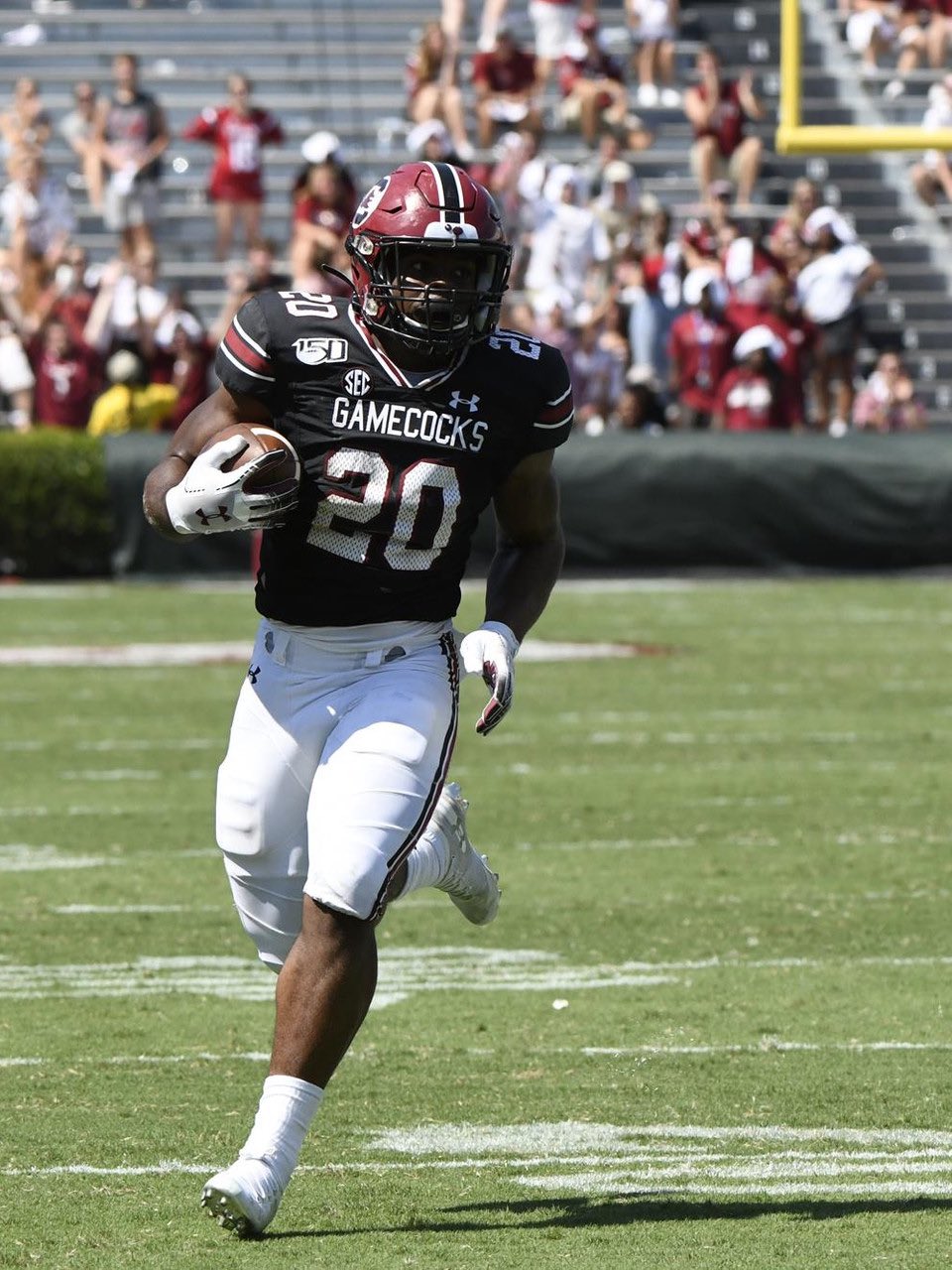
Beamer to change Logo, Uniforms and Helmets?

Yes. In our case, every representation of the spur I've seen on a Gamecock shows it as the attached kind.


Apples and oranges really. Cockfighting is taboo, so highlighting the killing instrument used in cockfighting (as noted in Batgirl's post) would be risky.

I'm not saying I agree with the rationale. Teams should call themselves whatever they want and have whatever logo they want. Maybe PETA wouldn't care at all. They haven't really messed with us for the past 20 years, so perhaps we're just not a big enough fish to worry about.
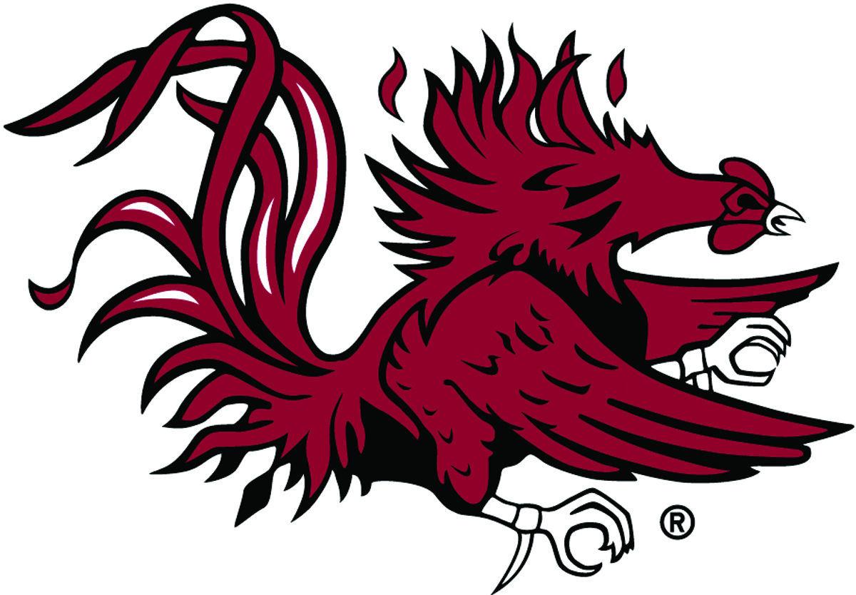
I know it's small, but the one on our main logo is the same as what I posted in a different color.
5b36dbb43d562.image.jpg
 
Before the Province of Carolina was divided between the haves and the have nots ( northern backcountry ) there was only one Carolina and its capital was Charleston. We must always claim Carolina as ours. While our ancestors were enjoying opera at the Dock Street those unwashed north of us were copulating with savages.
 
Last edited:
Before the Province of Carolina was divided between the haves and the have nots ( northern backcountry ) there was only one Carolina and its capital was Charleston. We must always claim Carolina as ours.

YESSSSSSSSSSSSSSSSSS! Our current helmet logo should remain in tact until Gabriel blows his horn.
 
If he does change anything, I hope he convinces the administration to just pay the price to get out from under armour and bring in Nike. Nike is a lot more relevant to the kids today than UA is. Some will say it doesn't matter but it most certainly does.
I love that idea or maybe Jordan. Looks like we are always following Auburn. They had Russell and then UA. Let be ‘THE USC’ not a little Auburn. I would not mind too if the whole SEC go to Nike or Jordan too. In the past few months I seeing where UA is trying to get out of it colleges contracts too. Wasn’t it was done under Spurrier too. Wonder why since he got a big paycheck from Nike at Florida.

UA is way out of most price ranges too. I heard for a good source you cannot reduce the price ranges as other too or your establishment will lose the UA contract.
#GoodbyeUA
#WelcomeNikeForevertothee
 
  • Like
Reactions: budman1976
Spurrier’s idea was to always wear white helmets. Muschamp liked the color rush style uniform like in the NFL. Maybe Beamer wants the SC baseball logo. Interesting to see what his plans are. I hope they ask about this Monday at the press conference.
Getting back to the OP. Given when he said he has immense pride in putting on a shirt with the Block C on the front, I don't think we have anything to worry about. We'll continue to use our trademarked logo of the Block C and Gamecock.
 
We have to clutch tight to our Carolina moniker. Block C/Gamecock loge does precisely that.
The gamecock definitely does, but not so much a block c. Lots of schools use block letters. The Gamecock alone would be nice if it were bigger, but the main problem is that it's so detailed.
 
Clemson and The Citadel both have block Cs. They're not both on the helmet, but they still use it to represent their schools. But it's okay, you have the right to be ignorant and wrong.
 
Last edited:
Clemson and The Citadel both have block Cs. They're not both on the helmet, but they still use it to represent their schools. But it's okay, you have the right to be ignorant and wrong.
As we do not use the Block C alone to represent us, it not really a good comparison to that other school and Citadel. We use a combination of the Block C and Gamecock. That is the only time you see the Block C on our uniforms, clothes, bags, stickers, etc, with the Gamecock superimposed on it.
 
As we do not use the Block C alone to represent us, it not really a good comparison to that other school and Citadel. We use a combination of the Block C and Gamecock. That is the only time you see the Block C on our uniforms, clothes, bags, stickers, etc, with the Gamecock superimposed on it.

It is iconic & recognizable everywhere!
 
The gamecock on the helmet is simply too detailed to be so small. It's only recognizable because it looks like a blob from afar. Again, I don't want anyone to think I dislike our logo. It's just the opposite. I have always loved it, but it needs to be extremely prominent to get all of the details. That's why it looks so good at midfield. JMO

GO 'COCKS!

OH MY GOSH!!!!!!!!!!!!!!!

Are you a fascist?!
 
ADVERTISEMENT

Latest posts

ADVERTISEMENT